Tutorials
Eine immer größer werdende Tutorialdatenbank.
PHP-Fusion Core
Aktuelle PHP-Fusion Vollversionen und Updates
Addon Downloads
Alle Downloads garantiert Kostenlos
Support 24/7
24 Stunden, 7 Tage die Woche, das ganze Jahr.
CSS3 Hover Animation 1
Kategorie: CSS
PHP-Fusion Version: Keine
Quelle: http://hasinhayder.github.io/ImageCaptionHoverAnimation/
Schwierigkeitsgrad:
Ein schöner Hoveranimationseffekt, der nur mit CSS realisiert wird und kein Javascript benötigt.
Faq
HTML-CodeGeSHi: HTML
- <div class="container-a1">
- <ul class="caption-style-1">
- <li>
- <img src="img/chaps_1x.jpg" alt="">
- <div class="caption">
- <div class="caption-text">
- </div>
- </div>
- </li>
- <li>
- <img src="img/everycowboy_dribbbleready_shot.jpg" alt="">
- <div class="caption">
- <div class="caption-text">
- </div>
- </div>
- </li>
- <li>
- <img src="img/ithinkican_01.jpg" alt="">
- <div class="caption">
- <div class="caption-text">
- </div>
- </div>
- </li>
- <li>
- <img src="img/m.jpg" alt="">
- <div class="caption">
- <div class="caption-text">
- </div>
- </div>
- </li>
- <li>
- <img src="img/raspberry.jpg" alt="">
- <div class="caption">
- <div class="caption-text">
- </div>
- </div>
- </li>
- <li>
- <img src="img/sketch_1x.jpg" alt="">
- <div class="caption">
- <div class="caption-text">
- </div>
- </div>
- </li>
- </ul>
- </div>
gewandelt in 0.003 Sekunden, benutzt wurde GeSHi 1.0.8.10
CSS
GeSHi: CSS
- h1,h2,h3,h4{
- padding: 0px;
- margin: 0px;
- }
-
- .caption-style-1{
- list-style-type: none;
- margin: 0px;
- padding: 0px;
-
- }
-
- .caption-style-1 li{
- float: left;
- padding: 0px;
- position: relative;
- overflow: hidden;
- }
-
- .caption-style-1 li:hover .caption{
- opacity: 1;
-
- }
-
-
- .caption-style-1 img{
- margin: 0px;
- padding: 0px;
- float: left;
- z-index: 4;
- }
-
-
- .caption-style-1 .caption{
- cursor: pointer;
- position: absolute;
- opacity: 0;
- -webkit-transition:all 0.45s ease-in-out;
- -moz-transition:all 0.45s ease-in-out;
- -o-transition:all 0.45s ease-in-out;
- -ms-transition:all 0.45s ease-in-out;
- transition:all 0.45s ease-in-out;
-
- }
- .caption-style-1 .blur{
- background-color: rgba(0,0,0,0.65);
- height: 300px;
- width: 400px;
- z-index: 5;
- position: absolute;
- }
-
- .caption-style-1 .caption-text h1{
- text-transform: uppercase;
- font-size: 24px;
- }
- .caption-style-1 .caption-text{
- z-index: 10;
- color: #fff;
- position: absolute;
- width: 400px;
- height: 300px;
- text-align: center;
- top:100px;
- }
-
- /** Nav Menu */
- ul.nav-menu{
- padding: 0px;
- margin: 0px;
- list-style-type: none;
- width: 490px;
- margin: 60px auto;
- }
-
- ul.nav-menu li{
- display: inline;
- margin-right: 10px;
- padding:10px;
- border: 1px solid #ddd;
- }
-
- ul.nav-menu li a{
- color: #eee;
- text-decoration: none;
- text-transform: uppercase;
- }
-
- ul.nav-menu li a:hover, ul.nav-menu li a.active{
- color: #2c3e50;
- }
-
- /** content **/
- .content{
- margin-top: 100px;
- margin-left: 100px;
- width: 700px;
- }
- .content h1, .content h2{
- font-family: "Source Sans Pro",sans-serif;
- color: #ecf0f1;
- padding: 0px;
- margin: 0px;
- font-weight: normal;
- }
-
- .content h1{
- font-weight: 900;
- font-size: 64px;
- }
-
- .content h2{
- font-size:26px;
- }
-
- .content p{
- color: #ecf0f1;
- font-family: "Lato";
- line-height: 28px;
- font-size: 15px;
- padding-top: 50px;
- }
-
- p.credit{
- padding-top: 20px;
- font-size: 12px;
- }
-
- p a{
- color: #ecf0f1;
- }
gewandelt in 0.002 Sekunden, benutzt wurde GeSHi 1.0.8.10
Quelle: http://hasinhayder.github.io/ImageCap...Animation/
Download auf https://github.com/hasinhayder/ImageC...rAnimation
Illustration Credit: Illustrations used in this example are coming from Mike | Creative Mints & Colin Hesterly
 Demo ansehen
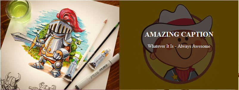
Tutorial Verlinken
URL:
BBCode:
HTML-Code:
Kommentare
Es wurden noch keine Kommentare verfasst.
Kommentar schreiben
Bitte logge dich ein, um einen Kommentar zu verfassen.
Anzeige
Anmelden
RSS Feeds
Feeds abonieren


Anzeige

